
Interactive documentaries offer the opportunity to integrate the traditional media form of film/video with coding and other skills related to new media production, including usability analysis and information architecture. Interactive media production is dependent on not only technical skills, but also design and storytelling; an effective website designed for a company or non-profit not only conveys information but also weaves together a narrative about the organization. Given this overlap between storytelling and new media texts, introducing interactive documentaries into the new media classroom is an effective pedagogical approach. It provides media students with the opportunity to take video skills possibly learned in another class—although my version below doesn’t assume that—and apply them to the new media environment, introducing the important concept that content can be divorced from a particular medium and distributed through a variety of platforms. This paper will describe how the process and requirements of creating an interactive documentary can be used to structure an intermediate web design course.
Specifically, an interactive documentary uses a web site to display video, text, and often other visuals (e.g., 3-D models, graphs, charts) about a particular topic. Rather than presented linearly as in a traditional film, multiple video segments are created, often each featuring the comments of just one speaker, which can then be viewed by users/viewers at their own pace and in their preferred order, allowing them to participate in the creation of meaning and the discovery of the interconnections within the work. Numerous examples of this new genre exist on the web (see Figure 1).
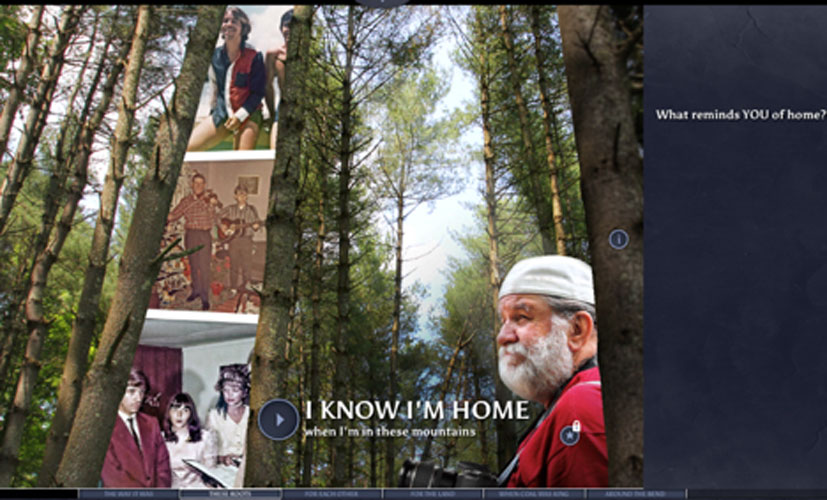
Miles [7] suggests that one can imagine interactive documentaries to be “computational nonfiction,” which situates the form to expand beyond film studies into “the procedural,” drawing a parallel between the procedural logic applied and learned by playing video games and the process of experiencing an interactive documentary. Extending this definition, interactive documentaries may also resemble an ARG (alternative reality game) in which the scenario reflects a real world event or situation [5]. As one example, virtual reality documentaries allow the user of VR technologies to simulate the user’s placement within a real space.
This dependence on software is part of what makes it “computational” and affects the user experience. Platforms like the content-neutral WordPress or documentary-specific Korsakow [6] allow filmmakers to make their own interactive documentaries without coding. However, an HTML/CSS hand coded interactive documentary provides the most flexibility for the creator and facilitates the introduction of web technologies into a video course or video into a web design class.
The major differences between linear and interactive documentaries are the control given to the user in charting his or her own path through the narrative and more generally, creating a particular narrative with a fixed library of video/information. Watson suggests that the act of plotting one’s own course through the video actually heightens the emotional attachment, and “is premised on a virtual encounter between subjects/information and the viewer/user that moves beyond the passivity and collectivity of traditional cinematic viewing to one of activity on the part of the viewer/user within a singular experience in front of a ‘deep’ screen interface consisting of a superfluity of data, stories, and possible experiences” [9].
Gifreu-Castells defines ten different navigation schemes with which one can traverse through the documentary. These include organizing text and video by 1) themes and chapters, 2) time periods, 3) maps and other geographical landmarks, 4) testimonials, or 5) story branches where the user chooses the path of the narrative. The others schemes are based on the type of media and less obviously narrative-based [3]. Interestingly, the ability of users to adapt to the unexpected interactivity is questioned by Bastajian, who suggests that introductory “traditional” videos that automatically play upon landing at a particular interactive documentary site can help establish a tone and direction for the subsequent interactivity—the traditional may be necessary to correctly experience novelty. This choice is up to each interactive documentary creator.
Aston and Gaudenzi define four subgenres of interactive documentary, including the now dated “conversational mode” which places the user into another place and simulates interactivity through older technologies (e.g., videodiscs). The “hypertext mode” is the most common, allowing the user to choose text and video to read/view from either a database or a network of HTML pages. The “participative mode” creates a dialogue between user and creator by allowing the user to add material to the database or website. The “experiential mode” combines information (text/video) with the real world through augmented reality software, making a location-specific documentary that combines the real with the virtual [1]. For many of these models, integrating interactive documentaries with location, either real through augmented reality, or graphically through maps on a page, has been a consistent, familiar model for navigation [4].
With an emphasis on the “hypertext mode” (despite the dated terminology), the interactive documentary format allows for a range of class projects. Nash defines the Interactive Documentary as having four “dimensions”: technological, relational, experiential [applied more generally than the “experiential mode” in the previous paragraph], and discursive. Specifically, the interactive documentary is defined by its technical affordances—how and on what platform it is presented (e.g., web, mobile phone, desktop computer, video game console). Relational describes the choices the user makes to create meaning from the content. Experiential flips that and considers the user’s experience and how the documentary produces an intellectual and affective reaction. Discursive addresses the ability of the user to form a “dialogue” of sorts with the content of the interactive documentary, reflecting on the overall experience [8] through a comments section or other sharing mechanism. These dimensions parallel the type of design, usability, and audience considerations all interactive makers must consider in developing a new product (e.g., website, game, etc.).
In summary, the conceptually rich interactive documentary provides students with a range of opportunities for theoretical and practical learning.
At St. John Fisher College in Rochester, New York, Interactive Media Design is offered as an elective for the B.A. in Media and Communication students. A more significant number of students in the class are pursuing a B.A. in Interactive Media and must choose a two-course track in web development or video game design. This course is part of the web development track. The course prerequisite of introductory web design is a requirement for all students in the major. Therefore, students coming into Interactive Media Design know basic HTML and CSS. The course is capped at 20, due to the size of the lab and the availability of video equipment.
The other web development course is entitled Advanced Web Development and covers JavaScript at an intermediate level as well as React.js and React Native. It is meant for students with previous programming experience. Conversely, Interactive Media Design has a greater focus on accessible front-end development and adopts a somewhat less rigorous approach to the use of jQuery and other libraries/plug-ins. Students don’t necessarily need to understand the JavaScript code underneath the jQuery and in some cases, may simply adapt preexisting code for their specific needs.
The following topics are covered in this 15-week class.
Documentary Theory (one week). The class briefly introduces students to the traditions and characteristics of documentary film, with an emphasis on the various genres and how those can be translated into interactive documentaries. A selection from Bill Nichols’ Introduction to Documentary (3rd edition) or similar readings are recommended. Two films in particular prove useful. The iconic “Man with a Movie Camera” (1929) is a favorite for new media theorists, as its depiction of the Russian cities of Kiev, Kharkov, Moscow, and Odessa doubles as both a travel and avant-garde film and the non-narrative approach suggests a database-driven interactive film, while still being constrained within a linear documentary format.
Showing students this film (or part of the film) helps them to start thinking “outside the box” when it comes to documentary presentation. I also use Errol Morris’ Fog of War from a formalistic perspective, as it primarily consists of an extended documentary with Robert McNamara and demonstrates the range of information and emotions that can be conveyed with a simple interviewing style.
While many interactive documentaries are available online, my primary example is the “Whiteness Project” (from PBS). The work consists of 20+ subjects from two different cities. The subjects are presented on a thematically appropriate white background; the videos are accessible via a carousel style interface. The unheard interviewer asks each subject to think about their whiteness and what it means for him or her. Overall, the piece deals with ideas of white privilege and institutional racism and introduces students to a topic that often makes them uncomfortable. This emotional reaction helps them understand the influence that an interactive documentary may have on the viewer/user—the carousel is easy to navigate, offers the user multiple choices at once, and constantly bombards the user with the “whiteness” of the participants.
Using the “Whiteness Project” as a model for the style of documentary, students are asked to work in groups to develop their own documentary. The topic must be one of social or political concern. Students do tend to shy away from such topics, and so I’ve often accepted less controversial issues like “Social Media Addiction”—the breadth and topic of the documentaries would be determined by the instructor to fit his or her own institution and philosophies about bringing politics into a “tech” classroom. I would encourage such exploration as a way to both engage student interest and address a purpose of a liberal arts education: to make students more cognizant of the world in which they live.
After that introduction, several technologies are covered:
Video production (two weeks). In the Interactive Media major, video production is an elective, so not every student has previous experience. Therefore, in the first iteration of the course, I had students film interviews in our studio. (Very basic studio use can be taught in one class period.) In later offerings of the class, I provide a one-day boot camp of basic video camera usage, covering the aesthetics of producing semi-professionally video—staying in focus, creating depth of field, applying rule of thirds, and recording good audio. On a second class day, basic video editing in Adobe Premiere is covered. Students only need to know how to create cuts and dissolves, adjust audio levels, perform basic color correction, and perhaps add titles (e.g., the name of the interviewee), although this text could just as easily be placed on the webpage. This isn’t meant to be a video class, and if expectations are kept to a minimum in terms of the imagery (e.g., one-person interviews in front of a simple or one color background) the results can be acceptable.
CSS Grid Layout and Flexbox (one-two weeks). This would be a review from an introductory web design class, but some students may have taken this first class in the previous year and such a recap is useful. Flexbox simplifies 2-dimensional layouts and layouts within a div.
Very Basic Flexbox Example by Jeremy Sarachan on CodePen.
CSS Grid Layout offers an easier method to layout pages using basic HTML and CSS, following a long line of techniques that harken back to tables in the 1990s and floats more recently. While many texts and websites cover the technique, Rachel Andrew’s The New CSS Layout offers a clear and concise description and is a very readable option for students.
Media Queries (included in CSS Grid Layout). Included in the CSS in conjunction with the CSS Grid Layout, media queries allow the coder to define different breakpoints and rules for the layout. In other words, given a screen of a specific size, varying among desktop, tablet, and mobile, these rules determine how a layout is structured. This topic is also covered in our introductory class, following the general philosophy that all sites should be made mobile first.
Parallax Scrolling (one week). This technique allows different objects on the screen to scroll at different rates or remain frozen with text moving over it. Several methods exist for achieving this effect—google it for recent examples—students can write their own code in jQuery, utilize a library, or even apply a simple method using only CSS. While the latter isn’t fancy, it can be an easy option for relatively inexperienced students. This particular page style can be used to create effective scrolling one page documentaries.
Basic Javascript, jQuery and Libraries (six-seven weeks). Several texts exist (online and in print) to learn the basics of JavaScript along with jQuery. While jQuery seems to have lost some favor in recent years, it still provides an easy means to manipulate CSS on the fly. For techniques related to fading and swapping out text and graphics, jQuery is useful. The increasing demand for all sites to be responsive (visible on mobile and the desktop web)— has led to fewer examples of animated navigation menus. However, slideshows and lightboxes are still commonplace and can be programmed with jQuery or implemented using a jQuery plugin. In this unit, we also considered a data visualization library (chart.js) for creating basic bar, line, and pie charts, etc. and the API of google maps for inclusion in the documentary.
Web and Audio Embedding (one week). While a generally easy topic often taught in a first web design class, a review of how to prepare the correct video format for the web to make it multi-browser compatible, along with how to embed video and control it through JavaScript should be covered. One challenge may be to consider the server space that students have available and the large size of video files—even after being formatted for the web. Another option is to upload them to YouTube or Vimeo for embedding from that site. It’s not ideal or entirely professional—but is a workable option.
Cognitive Psychology [intermixed with other content]. In our program, graphic design is handled in two previous classes: the introductory web design class and a class in print design, with assignments in the latter using the various tools of the Adobe Creative Suite. The intro web design class also introduces the idea of information architecture and various strategic tools (e.g., personas). After Interactive Media Design, the Senior Project class requires students to conduct focus groups, surveys, and to develop a UX strategy with research. The major project includes usability testing and eye tracking tests.
So, with placement in the middle of the curriculum, Interactive Media Design offers the opportunity to introduce students to concepts of cognitive psychology, with an emphasis on perception, memory, and how to design visuals that function effectively with the human sensory system. For a text, there are many options, although the classic Design of Everyday Things by Donald Norman, now in a second edition, works effectively, as does the interdisciplinary textbook: Designing with the Mind in Mind (2nd edition) by Jeff Johnson.
I covered this unit by assigning readings and spending the first 10-15 minutes of each class period discussing the material. There was an exam in the middle of the semester on the entire text, which also had to be incorporated into the final project design document.
In the final two weeks of the semester, students are given lab time to complete the documentary. The work, including the gathering of footage, was accomplished earlier in the semester. Groups of 3-4 students are formed early in the semester. They choose a topic “around a question of significance” such as:
Students are asked to complete a design document about four weeks before the end of the semester. This proposal/design document requires detailed sketches produced in a platform like Axure—which is free for colleges and universities (https://www.axure.com/) or Ninjamock (https://ninjamock.com/). The designs must demonstrate a clear conception and articulate the decisions made about the visuals of the pages, including color, typefaces, video placement, visualizations, maps, and the user interface. As mentioned above, the document must include explanations of design decisions based on the concepts learned in the cognitive psychology unit. Finally, a list of questions that will be asked in the interviews and the names of those people who will be interviewed are provided. The names are only required as a check that the students were making satisfactory progress in finding people to interview.
The final submission is a working online version of the documentary. I also have the students post the files to GitHub, as this is a normal expectation of many of our classes. I always reserve the right to give students working in groups different grades and ask each group to submit a document stating each person’s role—which they all must sign. The workload for each student should be roughly equal. I discuss this with the group members throughout the semester.
In grading the assignment, I primarily consider the visual aesthetics and success of telling a story. Students must include a selection of the skills discussed above (e.g., parallax scrolling, chart.js, jQuery) as appropriate. Not all techniques might be necessary for a given project. Furthermore, students must complete at least eight interviews, although depending on the topic and group size, that number may vary. I consider the accuracy of the code as well, and whether it’s well-commented. In cases where code snippets from other sites are used, that should be noted. The number of pages varies widely, and may even be one if parallax scrolling is used. An example student project, “Social Media Addiction,” can be seen here: https://sporealy.github.io/socialmediaaddiction/
This class combines an exploration of several JavaScript libraries with a review of HTML/CSS layout techniques, along with a broader introduction to the genre of interactive documentaries. Several exercises are required throughout the semester to allow students to practice the new skills, and when appropriate, I allow them to produce elements of the interactive documentary (e.g., maps, data visualizations) as an option to fulfill the requirements of the individual exercises assigned in the first part of the semester. This way, groups often have multiple materials for the final project from which to choose. In the final two weeks of the semester, students place the elements, including the videos. This process of dividing up the work throughout the semester not only makes the workload for the final project more reasonable, but also teaches students about project management.
Given the emphasis on project-based learning, the interactive documentary with all of its components allows instructors to create a coding course that includes a meaningful end goal and socially-relevant subject matter.
To cite this article:
MLA: Sarachan, Jeremy. “The Interactive Documentary as a Project-Based Coding Class.” Coding Pedagogy, edited by Jeremy Sarachan, 2019, ch. 5, http://codingpedagogy.net. Accessed 1 Apr. 2020. [update access date]
APA: Sarachan, J. (2019). “The Interactive Documentary as a Project-Based Coding Class.” In J. Sarachan (Ed.), Coding Pedagogy, ch. 5. Retrieved from http://codingpedagogy.net.
Chicago:Sarachan, Jeremy, “The Interactive Documentary as a Project-Based Coding Class,” in Coding Pedagogy, ed. Jeremy Sarachan, ch. 5, Coding Pedagogy, 2019. http://codingpedagogy.net.